পণ্য


.svg)

.svg)
Craft engaging designs to captivate your audience.

Update May 2026
Getting your colors right isn't just a technical checkbox — it's the difference between a product that wows customers and one that generates refund requests. Whether you're designing your first unisex t-shirt or scaling up to an all-over-print line, understanding color profiles, resolution, and rendering techniques will directly impact your print quality and your bottom line.
This guide covers the two core color systems every POD seller needs to know, the resolution standard that separates crisp prints from pixelated disasters, and one common design shortcut you should avoid entirely.
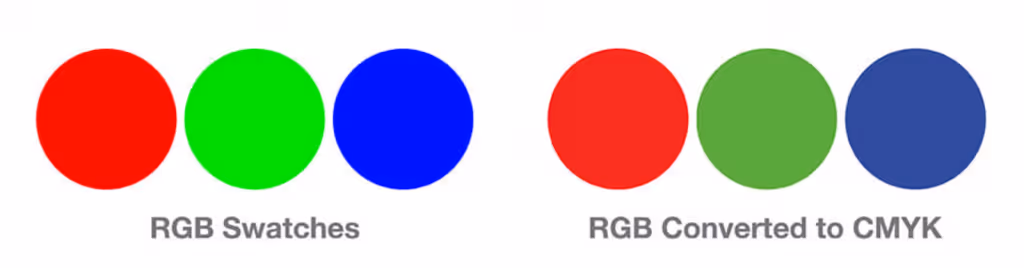
Color profiles are frameworks that define how colors are created and displayed. The two you'll encounter most often are RGB and CMYK, and they work in fundamentally different ways.
RGB stands for Red, Green, and Blue — the three primary colors of light. Your monitor, phone, and any digital screen combine these three channels to produce every color you see. Want yellow? Your display mixes red and green light to create it. RGB is an additive color model: the more light you add, the closer you get to white.

Because all design software — Photoshop, Illustrator, Canva — runs on a screen, your working canvas is naturally in RGB. This is important to keep in mind: the colors you see while designing may look richer or more saturated on screen than they will in the final printed product.
CMYK stands for Cyan, Magenta, Yellow, and Key (black). Unlike RGB, CMYK is a subtractive color model — inks absorb certain wavelengths of light, and the combination of all four produces a nearly full color range on paper or fabric.
Every commercial printer, including GearLaunch's DTG (direct-to-garment) printers, operates in CMYK. This is why designing in CMYK gives you a far more accurate preview of how your design will actually print. CMYK has a slightly narrower gamut than RGB, meaning some ultra-vivid screen colors won't reproduce exactly in print — but designing in CMYK from the start ensures there are no surprises.
The right workflow: Design in CMYK, then save and export in an sRGB color profile. This combination gives you print-accurate colors during the design process while producing a file that's correctly formatted for digital upload. GearLaunch has a step-by-step tutorial showing exactly how to do this in Photoshop — if you work with a freelance designer, they should already know this process.
GearLaunch accepts both JPEG and PNG files, but for DTG apparel — hoodies, t-shirts, and all-over-print clothing — PNG is the stronger choice. PNG files support transparent backgrounds, which is critical for designs that need clean edges against a garment color. JPEG files use lossy compression that can introduce artifacts and muddy fine details, especially around edges and text.
Use PNG as your default export format for any apparel design.
DPI stands for Dots Per Inch, and it determines how sharp and detailed a print looks at actual size. Computer monitors display images at 72 DPI, which looks fine on screen but produces blurry, soft prints when run through a DTG or sublimation printer.
The standard for quality printing is 300 DPI. This applies at the actual print dimensions of your product — not at a scaled-down preview size.
A common mistake: taking an image from the internet, changing the DPI setting in Photoshop, and expecting a high-quality print. Changing the DPI value without resampling the image doesn't add new pixel data — it just redistributes the existing pixels. The result may appear different in the file settings, but the actual image quality remains low.
The correct approach is to build your design from scratch at 300 DPI and at the correct print dimensions from the very beginning. For apparel, GearLaunch recommends 3600×4800 pixels at 12"×16", which produces exactly 300 DPI. Check the Print 101 guide and individual product pages for exact dimension specs on other product types.
Anti-aliasing is a rendering method that smooths the jagged edges of graphics, fonts, and shapes by adding semi-transparent pixels along the boundaries. On screen, this creates the illusion of smooth curves. In print, it creates a problem.

DTG printers don't handle transparency well. Those semi-transparent edge pixels — the ones anti-aliasing adds to smooth your design — get interpreted inconsistently by the printer, often appearing as a faint halo, color bleed, or outright rejection of the file. GearLaunch printers will reject artwork containing transparencies.
Turn off anti-aliasing when saving or exporting your designs. In Photoshop, this setting appears in the tool options bar for text and selection tools. For the cleanest print results, your design should have fully opaque pixels at all edges. For a deeper look at this and other technical requirements, see the Design Tips – Artwork Requirements article.
Beyond the technical settings, color choices directly affect how well your designs sell. Simpler color palettes consistently outperform complex ones on POD products. According to GearLaunch's own research, 47% of merchandise from top-performing campaigns featured two colors or less.
Contrast is also essential. A dark design on a dark garment, or a light design on a light garment, reduces visibility and makes the product look cheap. Always pair your design against a contrasting base color. For all-over-print products like men's tops or women's tops, your design itself becomes the garment surface, so contrast within the design artwork matters even more.
Avoid gradients. They rarely print well on DTG and can look washed out or banded on fabric. If you need a gradient effect, use halftones instead — a technique that mimics tonal transitions using a pattern of dots, which printers handle cleanly. For more on this, the Creating Designs Basics guide covers color strategy in detail.
Before submitting any design, run through this checklist:
Why does my design look different in print than it does on my screen? Screens display colors using RGB (light), while printers use CMYK (ink). These two systems have different color ranges, and some vivid screen colors simply can't be replicated with ink. Designing in CMYK from the start minimizes this gap because you're previewing colors within the printable range, not the full RGB spectrum.
Can I just convert my RGB design to CMYK before uploading? You can, but the conversion often shifts colors in unexpected ways — especially for vivid blues, greens, and oranges. It's much better to build the design in CMYK from the beginning so you're working in print-accurate colors throughout the process.
What happens if I upload a file under 300 DPI? Low-resolution files produce blurry, pixelated prints. The issue is permanent — there's no way to recover quality after printing. GearLaunch's product templates include exact pixel dimension requirements for each product to help you set up files correctly.
Why does GearLaunch reject files with transparencies? DTG printers apply ink based on solid color data. Semi-transparent pixels (common in anti-aliased or layered files) create ambiguity the printer can't resolve cleanly, often producing halos, smearing, or incomplete ink coverage. Flat, fully opaque designs produce the sharpest results.
Does PNG work for all product types, not just apparel? PNG is the recommended format for apparel. For other products like canvas wall art or blankets, check the individual product page for artwork requirements and recommended formats, as specs vary.
Ready to put these principles into practice? Browse the full product catalog to find the right canvas for your next design, or go straight to creating a product and start building.


.svg)
.svg)
.svg)