পণ্য


.svg)

.svg)

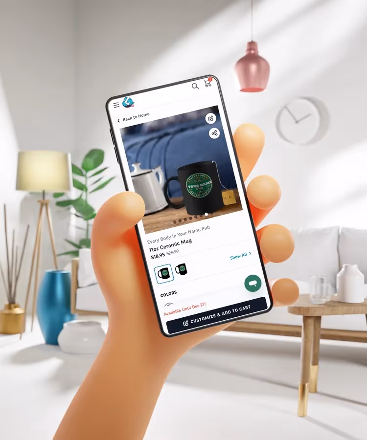
Ever felt the frustration of checking your store on your phone and seeing a beautiful design look cluttered, slow, or just plain wrong?
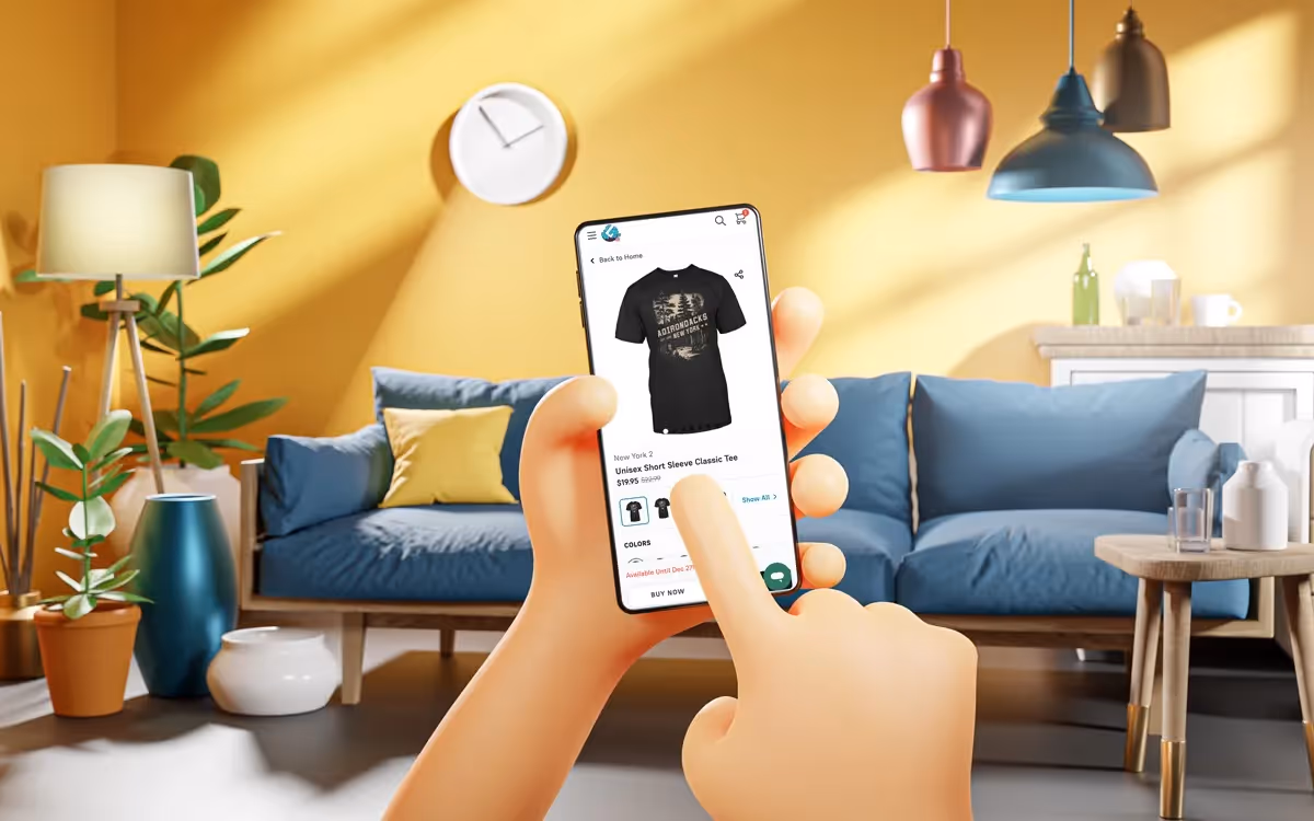
You’re not alone — today, over 60% of eCommerce traffic comes from mobile devices, and if your product images don't look great on a 6-inch screen, you're leaving money on the table. The days of desktop-first design are long gone; your mobile friendly print on demand mockups are now the most critical component of your product page.
In this guide, we'll move beyond basic responsiveness and dive into the specific design and technical strategies top sellers use to maximize conversions on mobile. You'll learn how to transform a lazy product photo into a high-converting mobile asset.
Mobile shopping isn't just a smaller version of desktop shopping—it’s a fundamentally different experience. Mobile shoppers are moving fast, expecting instant loading times, and scanning product pages rather than reading them. Your mockups must tell the whole story in a single glance.
A strong mobile friendly print on demand mockup strategy starts with two pillars: Clarity and Speed.
Creating a truly great mobile experience requires adjusting how you use your favorite POD mockup generator. It's about working with the mobile interface, not against it.
A common mistake is using generic, low-quality mockups. A professional-grade POD mockup generator for mobile should allow you to specifically frame the product for a vertical or square aspect ratio, as this translates best to phone screens.
Practical Steps for Mobile Optimization:
According to Statista’s 2024 eCommerce data, the share of mobile retail commerce sales is projected to exceed 70% globally, underscoring the urgency of this optimization.
Your product listing is a funnel, and mobile-first product listing best practices dictate that every photo must justify the next step—clicking "Add to Cart." Remember, you’re not alone — every top seller once started with just one product, and even the largest brands continuously test their mobile UX.
To set up a resilient foundation for the next peak season, be sure to review our comprehensive New Year Selling Guide.
The future of eCommerce is in the palm of your customer's hand. By focusing on mobile friendly print on demand mockups that are fast, clear, and designed with a mobile-first perspective, you are optimizing the single most impactful part of your selling strategy. It's time to stop treating mobile optimization as a checklist item and start treating it as your main design priority.
Ready to take control of your campaigns? Start applying these principles to your listings today and watch your mobile conversions soar. Discover more tips on how to choose the perfect product for your niche on the GearLaunch blog.


.svg)
.svg)
.svg)